Interpreting building efficiency
In colder months you will need to use more energy to heat your building than in warmer months. But how much more should you be heating your building when it’s cold? Are you wasting energy?
To start to learn how well your building is running, look at your Heating Efficiency Performance, which is the first chart you see when you go to Performance > Heating > Performance. The orange line (performance line) shows your current trend in energy use for your building against the outside weather. The graph shows that the colder it is outside during a particular week, the more energy you are predicted to use. The blue dots are your actual energy usage for a particular week. The closer your dots lie to the orange line, the more your energy use depends on the weather outside.
The slope of the performance line shows how strongly the weather affects your heating demand; the larger the slope, the more sensitive the amount of energy required to heat your building is to the weather. This means that an inefficient building will have a large slope, as a small rise in outside temperature means a large increase in the amount of energy needed. Conversely, an efficient building will have a shallow slope, because even in the depths of winter when it is very cold, the additional energy needed is small.

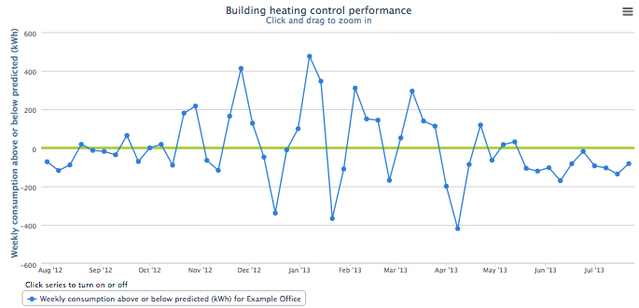
Next, look at your Control Chart in Performance > Heating > Control. The Control Chart shows you how much energy you are over- or under-using on a weekly basis compared to your current trend. The closer you are to the zero line, the closer you are to your average efficiency, and if you have a line below the zero line it means that you have been far more energy efficient that week than expected!
Finally, you can look at your Weather-Corrected Chart by going to Performance > Heating > Normalised. The Weather-Corrected Chart shows two things: how much total energy you use in a calendar year (the red bars), and how much energy you were predicted to use for those years, with the weather taken into account (green line). If the red bar is lower than the green line for a year, this means that you have used less energy than expected, and are being efficient with your energy use. If the red bar is higher than the green line then this means you have used more energy than expected, and you are heating your building inefficiently.
